CSS3 Examples and Best Practices
Posted by drikin on 2010年2月17日 02:26

I had a slightly impressive from this blog entry.
CSS3 Examples and Best Practices: "Notice how Analog use a 1 pixel text shadow to make the text look embossed? The image in the green circle is captured with a text-shadow supported browser and the image in the red circle is captured with a unsupported browser."Googleによる日本語変換はこちら
Especially, Emboss-Looking Text at first section is really useful. I known text-shadow that is new CSS3 property but I haven't been realizing 1 pixel shadow to make the text look embossed before.
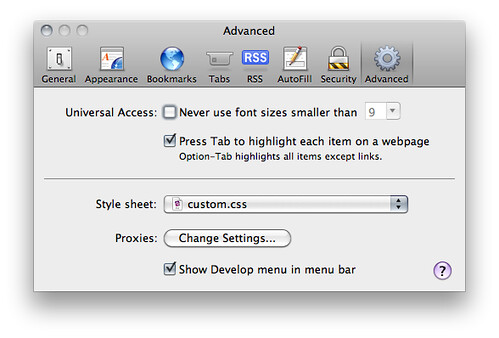
This small improvement is useful for the almost of all websites. Then I've been trying to introduce it as the custom style sheet for Safari.
body {
	text-shadow: 0px 1px 1px #e6e6e6;
}

It's really simple. I just put above css to the text file. And I specified this css file in the preference at Safari.
It will becomes the sites as a little bit more showy. Please try it.